Below are the plans that I have made for my digipack and magazine poster.
Thursday, 30 November 2017
Wednesday, 29 November 2017
Ancillary Research
The Avatar poster is good, one reason for this is the establishing shot at the bottom of the page, I like this poster becasue the two characters at the top of the page, this is because the poster is saying that the characters are close, which in the film they are. The blue of the faces is good as it fits with the text at the bottom of the screen. However, I think that the poster could be improved, one way that the poster could be improved is by increasing the size of the title of the film as I believe that it is too small.

Even though this is not a film poster, I think that I can use this design in my poster, as it can make the poster stand out and look good. However, I would make the colurs black and white as the technicolor will not fit with the theme of the music video. The cartoon effect is one that I think looks good and aesthetically pleasing.

The tilte of the film being in the black of the bottom of the Titanic is good. I like that the boat is vertical as it is foreshadowing what will happen in the film. The characters at the top of the page is similar to the Avatar poster, this is because I would like this effect of one behind the other in my poster. The fade of the characters at the bottom of the page is also something that I would like to have in my poster.

The two characters in the middle of the poster is different to the posters previously, this is more of what I want in my poster as I plan to have nothing underneath the characters. I like that the poster is all in dark colous as my poster will be similar to this as in my poster there will be no bright colours as it does not fit the tone of the music video. I like that the title stands out from the rest of the poster.

This poster is similar to the previous posters as they also have large images of the characters on the poster, however, this is more similar to the Avatar and Ttanic poster, which is not what I am not going for, because I want the characters to be more in the centre of the screen. However I like the image of the ships below the characters as it looks aesthetically pleasing.

This poster is the most similar to the look that I want in my poster, as it has the main character in the foreground and another rightbehind in the background. I like the image of the skeleton behind as it looks faded and fits with the colours in the background, this makes the poster look better in my opinion. The gold title below contrasts well with the colours in the actual poster.
From this I have learnt what actual posters look like and I have learnt how to take elements from the posters and make it into my own piece.
Monday, 20 November 2017
Intertexuallity
Intertexuallity is referencing another text in another text. This reference casn be done in two ways:
Parody
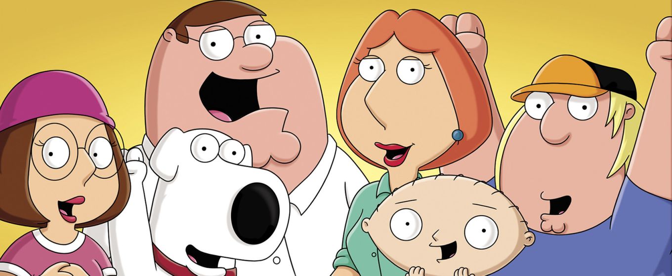
A parody is referencing another text in a humorous way. This can be directly at the text or a genre. One exapmle of this is Family Guy, as the show references different texts in every show and most of the time it is to make the audience of the show to laugh.
Pastiche
A pastiche is pating homage to another text, this can be basing the text as a whole on the other text or taking a part of the text that is iconic or has influenced the text and putting it into the film, television show or music video etc. An example of this is the music video to Telephone by Lady Gaga, this is because the music video has many references to Quentin Tarantino's films. Such as the opening text is from Pulp Fiction and the "Pussy Wagon" is a reference to Kill Bill.

From this i have leant the difference between Parody and Pastiche, but also I have learnt more about intertextuallity.
Saturday, 11 November 2017
Make up
When filming the scenes, make-up was put on the actors, this is so the film looks better and more professional. Below is a shot of adding the make-up onto the male character, which is played by Eddie Wilkinson.
Below is a photograph of the male character, Eddie, before the make up was applied and after.
Below is a photograph of the female character, Joy, before the make up was applied and after.
From this I have learnt that appling make-up to the cast before filming will make the overall product better and the film will look more professional.
Friday, 10 November 2017
Audience feedback on one minute of footage
This is the audience feedback to the one minute of footage that was edited.
I have recently shown the one minute of footage to my primary audience, from this they have given me feedback on the music video so far, from this I can improve the music video, to make it better quality.
- The first shot of the main character has his eyes looking down. From this feedback, I will refilm this shot so that the main character is staring at the camera.
- It would look better if the characters infront of the green screen should be in black and white, this will mean that the shot would look better. I will edit the film so that the characters in the foreground will be in black and white.
- The characters in the chourus have their glasses on, this shows the refelction. I will refilm this shot, with the characters without glasses, this will make the shot better.
- The chorus needes to have cuts in it so that the viewer will not get tired of the same shot for so long. From this, I will add in more shots inbetween parts of the chorus.
I have recently shown the one minute of footage to my primary audience, from this they have given me feedback on the music video so far, from this I can improve the music video, to make it better quality.
One minute of film
This is the one minute of film that has been edited so far, the footage has been edited so that it fits with the codes and conventios that I said that I would use at the start of research.
Thursday, 9 November 2017
The audience to my music video
Below are some of my audience for my music video. I will be showing them my video throughout the process of editing and the feedback that the give will help me to produce a good quality music video. This is because I will use the feedback that they will give me to make my music video better, as I will improve the parts that the audience did not like.


Wednesday, 8 November 2017
Audience Profile
Name: Dylan Fielding
Age: 17

Alternative
Favourite type music video
Animation
How do you watch music videos?
YouTube
What do you think of our idea?
It's good, very deep meaning
What social media do you use?
SnapChat, YouTube, Instagram
How do you find out about new music video?
Youtube trending tab

From this I have learnt more about Dylan, such as his likes and dislikes and how he watches and accesses music videos. This is good as I know how people like Dylan (who are my target audience) access music videos and find them.
Audience
The audience is critical when making a media product, without the audience there are no viewers, this means that there is no money earned. So the media industry tailors their products to a certian audience. From this they can collect feedback from the audience and make the product better from the improvements made. Through the process of making my music video, I will get feedbakc from my audience to make the product better.
Fragmented audience
A fragmented audience is the division of audiences, the audience are in smaller groups because of the variety the media can be consumed. For expample news can be consumed in different ways, Television, Newspapers and, now becuase of the impact of new technology, the Interent
The different types of audience
The two different types of audience are Mass and Niche audiences. A mass audience is one that consumes main stream media. Where as a Niche audience is a audience that has a unique interest. When creating my music video I will be using the critisism that I will get from my Niche audience.
Categories
Audiences are categorised so that media products are tailored to their interests, this means that the product will be successful and earn lots of money when it is released. The categories are:
Group A - Lawyers, Doctors, Well paid professionals
Group B - Teachers, Fairly well paid professionals
Group C1 - Junior management, Nurses, "White collar" professions
Group C2 - Electricians, Plumbers, "Blue collar" professions
Group D - Drivers, Post workers
Group E - Students, Unemployed, Pensioners
The audience that will be my niche audience is Group E, as my product is tailored for teenagers, this is why I will use a teenage cast in my music video.
Pick and Mix theory
The pick and mix theory is the idea that audiences consume different types of media, such as YouTube and Spotify.
From this I have learnt the different types of audience that are there, I have also learnt about the niche audience I will use and what group my niche audience is. This helps me as I can mold my music video to be of my niche audience's interests.
Wednesday, 1 November 2017
Green screen alternative
As an alternative to green screen, I tested a projector. As if the green screen does not work, I will be able to use a projector. I have taken some photos, these photos are with lighting, as I will use lights in my music video. These are the photos that I took.
After testing projecting the images, I found that the photos have an effect that looks different and stylish. This is that the image is projected onto the characters face, this gives the image a effect that looks different. However the projector has the shadow of the character ion the screen, this is not good as it is taking up space that is needed for the background.
From this I have learnt how to use a projector if the green screen does not work, this means that no time is wasted, learning how to use the projector. However I would rather use a green screen as it looks more professional and there is no shadow in the background.
Subscribe to:
Comments (Atom)